|
|
|
|
Also see our huge range of Charting Software . Got a Excel Chart question? Use our FREE Excel Help
For column, bar, cylinder, cone and pyramid charts there is an option to automatically display an alternative color if the value is negative. This feature can be very handy but configuring it is awkward to say the least.
How To Use 'Invert if negative'
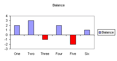
Lets Start with a normal column chart. Negative bars are currently colored the same as positive
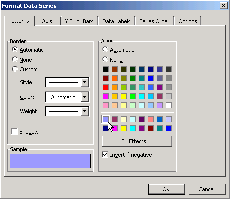
From the Format Data Series dialog we can enable the 'Invert if negative' option.
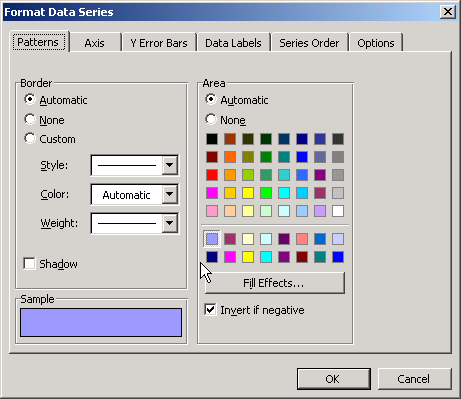
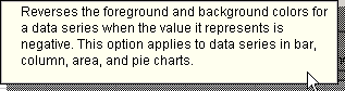
This is how the Invert if negative will work according to the help.
(Note: pie charts do not plot negatives and the option is not available for either pie or area)
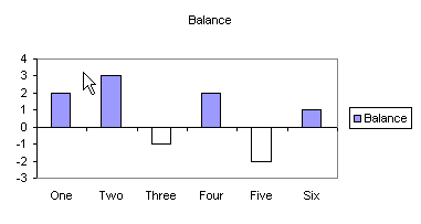
The result is a different color for the negative values.
So now we want to select a suitable negative color.
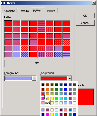
If we once again display the Format Data Series dialog and press Fill Effects we
will see the dialog shown below. The Foreground color matches the positive bars
and the Background color matches with the negative bars.
So we change the
background color to the desired color for our negative bars.
Now you may have noticed that all the Patterns contain a mixture of Foreground and Background. As we want solid colors we will have to select the pattern with the least intrusive pattern, which is the 5% pattern.
So now the bars are have different colors for positive and negative values.
BUT wait, they are the complete opposite of what we want.
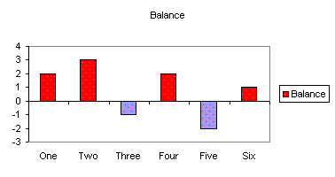
Lets go back to the Fill Effects dialog and swap the color selection
That's better, we now have the right colors for the positive and negative bars. Although our chart looks as though it has measles.
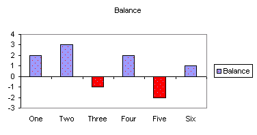
To get rid of those spots go back to the Format Data Series dialog and select the required color for the positive bars.
There we go a chart with solid positive and negative colors.
Back to Excel Charts Index
Excel Dashboard Reports & Excel Dashboard Charts 50% Off Become an ExcelUser Affiliate & Earn Money
Special! Free Choice of Complete Excel Training Course OR Excel Add-ins Collection on all purchases totaling over $64.00. ALL purchases totaling over $150.00 gets you BOTH! Purchases MUST be made via this site. Send payment proof to [email protected] 31 days after purchase date.
Instant Download and Money Back Guarantee on Most Software
Excel Trader Package Technical Analysis in Excel With $139.00 of FREE software!

Microsoft � and Microsoft Excel � are registered trademarks of Microsoft Corporation. OzGrid is in no way associated with Microsoft
Some of our more popular products are below...
Convert Excel Spreadsheets To Webpages | Trading In Excel | Construction Estimators | Finance Templates & Add-ins Bundle | Code-VBA | Smart-VBA | Print-VBA | Excel Data Manipulation & Analysis | Convert MS Office Applications To...... | Analyzer Excel | Downloader Excel
| MSSQL Migration
Toolkit |
Monte Carlo Add-in |
Excel
Costing Templates
FREE Excel Help