|
|
|
|
Also see our huge range of Charting Software . Got a Excel Chart question? Use our FREE Excel Help

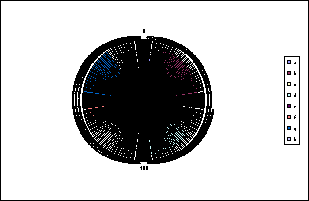
Chart is a filled radar chart with multiple series.
Below is the chart data. In the range B2:B9 is the value of each slice within the
pie. The range C2:C9 is the percentage radius for each slice.
Values in J1:Q4 are derived from formula in order to calculate the angles and length
of each slice.
| A | B | C | D | E | F | G | H | I | J | K | L | M | N | O | P | Q | |
| 1 | Slice Value | Slice % | % Value | 0.702893488 | 0.908775735 | 0.294791895 | 0.903831326 | 0.43898482 | 0.934085161 | 1 | 0.268068474 | ||||||
| 2 | a | 1 | 70% | % of 360� | 0.05 | 0.2 | 0.1 | 0.15 | 0.2 | 0.05 | 0.15 | 0.1 | |||||
| 3 | b | 4 | 91% | Start Angle | 0 | 18 | 90 | 126 | 180 | 252 | 270 | 324 | |||||
| 4 | c | 2 | 29% | Finish Angle | 18 | 90 | 126 | 180 | 252 | 270 | 324 | 360 | |||||
| 5 | d | 3 | 90% | Category Names | a | b | c | d | e | f | g | h | |||||
| 6 | e | 4 | 44% | Angles | 0 | 0.702893488 | 0 | 0 | 0 | 0 | 0 | 0 | 0 | ||||
| 7 | f | 1 | 93% | 1 | 0.702893488 | 0 | 0 | 0 | 0 | 0 | 0 | 0 | |||||
| 8 | g | 3 | 100% | 2 | 0.702893488 | 0 | 0 | 0 | 0 | 0 | 0 | 0 | |||||
| 9 | h | 2 | 27% | 3 | 0.702893488 | 0 | 0 | 0 | 0 | 0 | 0 | 0 |
Here are some of the formulae
| H | I | J | K | L | |
| 1 | % Value | =C2 | =C3 | =C4 | |
| 2 | % of 360� | =B2/SUM($B$2:$B$9) | =B3/SUM($B$2:$B$9) | =B4/SUM($B$2:$B$9) | |
| 3 | Start Angle | =360*SUM($I$2:I2) | =360*SUM($I$2:J2) | =360*SUM($I$2:K2) | |
| 4 | Finish Angle | =360*SUM($J$2:J2) | =360*SUM($J$2:K2) | =360*SUM($J$2:L2) | |
| 5 | Category Names | =A2 | =A3 | =A4 | |
| 6 | Angles | 0 | =IF(AND($I6>=J$3,$I6<=J$4),J$1,0) | =IF(AND($I6>=K$3,$I6<=K$4),K$1,0) | =IF(AND($I6>=L$3,$I6<=L$4),L$1,0) |
| 7 | 1 | =IF(AND($I7>=J$3,$I7<=J$4),J$1,0) | =IF(AND($I7>=K$3,$I7<=K$4),K$1,0) | =IF(AND($I7>=L$3,$I7<=L$4),L$1,0) | |
| 8 | 2 | =IF(AND($I8>=J$3,$I8<=J$4),J$1,0) | =IF(AND($I8>=K$3,$I8<=K$4),K$1,0) | =IF(AND($I8>=L$3,$I8<=L$4),L$1,0) | |
| 9 | 3 | =IF(AND($I9>=J$3,$I9<=J$4),J$1,0) | =IF(AND($I9>=K$3,$I9<=K$4),K$1,0) | =IF(AND($I9>=L$3,$I9<=L$4),L$1,0) |
Create a standard Filled Radar chart from the data in range I5:Q366
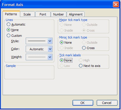
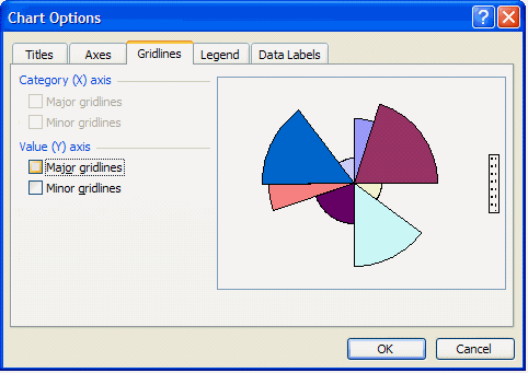
Format the Value axis to remove lines and tick mark labels. Set the Minimum value to 0 and the Maximum value to 1. Use the Chart Options dialog to clear Major gridlines. Finally select and clear the Category labels.
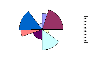
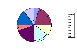
If you want to display the slices then you need to add another series and plot it on the secondary axis. Add the range A1:B9 to the chart.
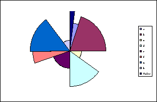
Select the new series and change the chart type to Pie.
Download Example workbook with data and formula
Back to Excel Charts Index
Excel Dashboard Reports & Excel Dashboard Charts 50% Off Become an ExcelUser Affiliate & Earn Money
Special! Free Choice of Complete Excel Training Course OR Excel Add-ins Collection on all purchases totaling over $64.00. ALL purchases totaling over $150.00 gets you BOTH! Purchases MUST be made via this site. Send payment proof to [email protected] 31 days after purchase date.
Instant Download and Money Back Guarantee on Most Software
Excel Trader Package Technical Analysis in Excel With $139.00 of FREE software!
Microsoft � and Microsoft Excel � are registered trademarks of Microsoft Corporation. OzGrid is in no way associated with Microsoft
Some of our more popular products are below...
Convert Excel Spreadsheets To Webpages | Trading In Excel | Construction Estimators | Finance Templates & Add-ins Bundle | Code-VBA | Smart-VBA | Print-VBA | Excel Data Manipulation & Analysis | Convert MS Office Applications To...... | Analyzer Excel | Downloader Excel
| MSSQL Migration
Toolkit |
Monte Carlo Add-in |
Excel
Costing Templates